Weather Application→
There are many weather applications available on the market. The quality of the visuals, the
layout, the legibility and typographical quality, as well as the ergonomics of navigation, all
play a part in the choice of one application over another. As competition in this field is
fierce, the aim is to make people want to see the weather in an effective, aesthetic and
original way.
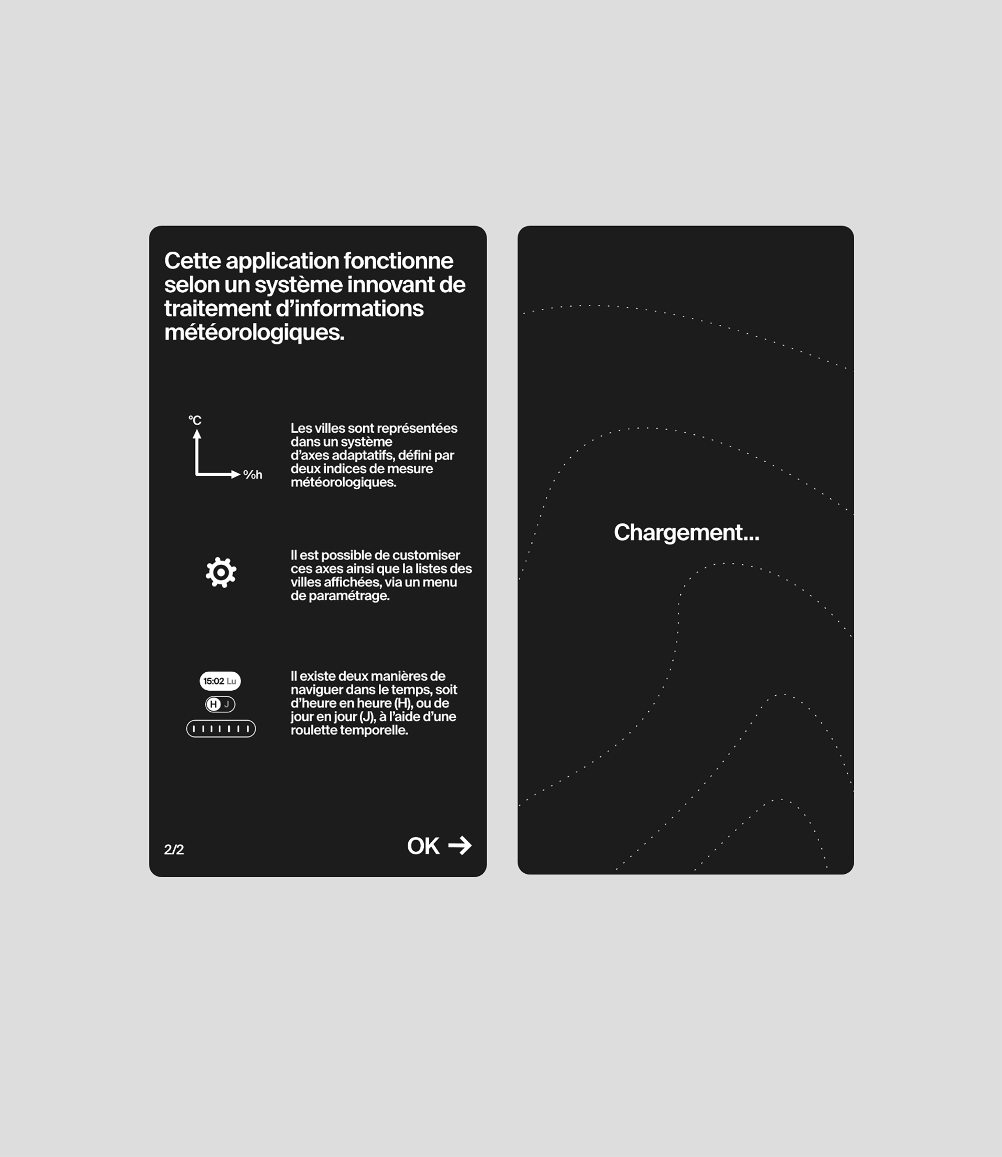
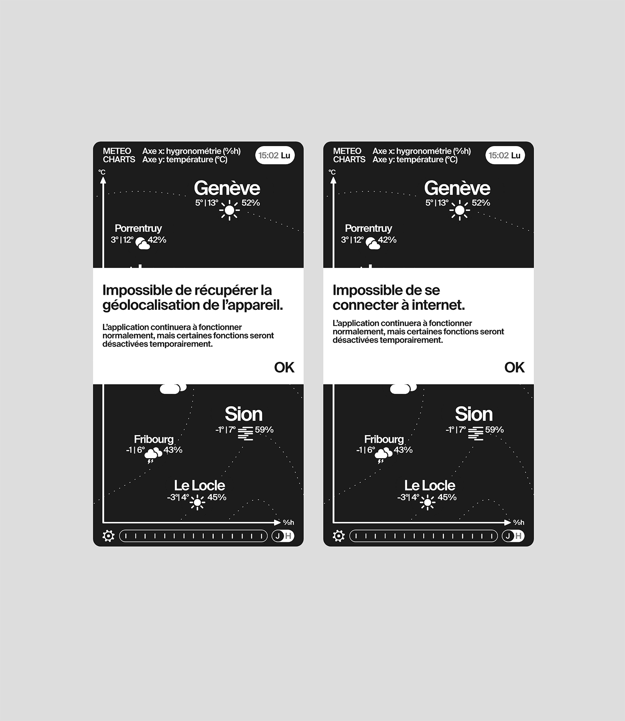
The strategy chosen to set the application apart from the market is to propose a soberly
designed technical tool, with a flexible, customizable and innovative approach to viewing
meteorological data.
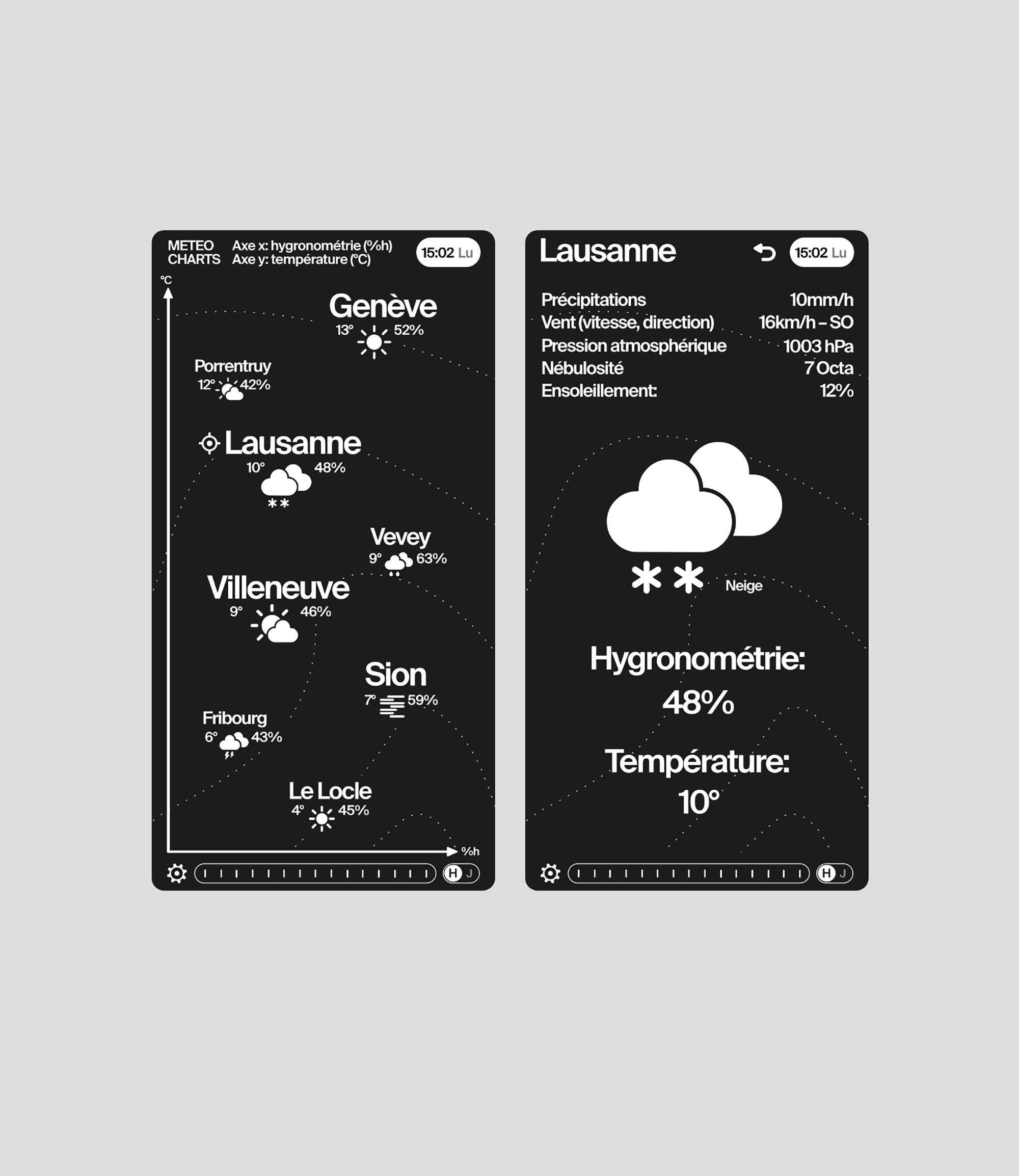
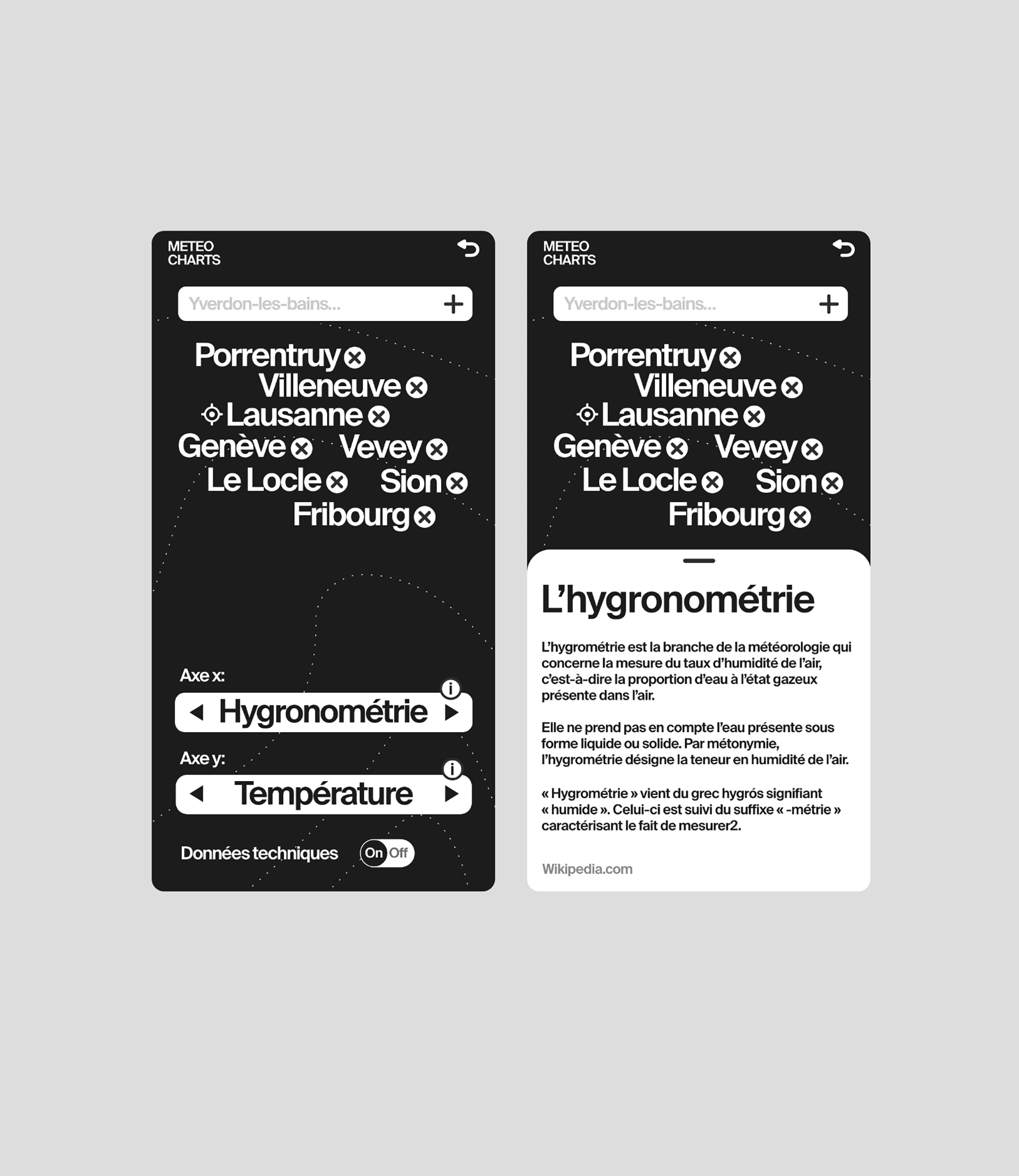
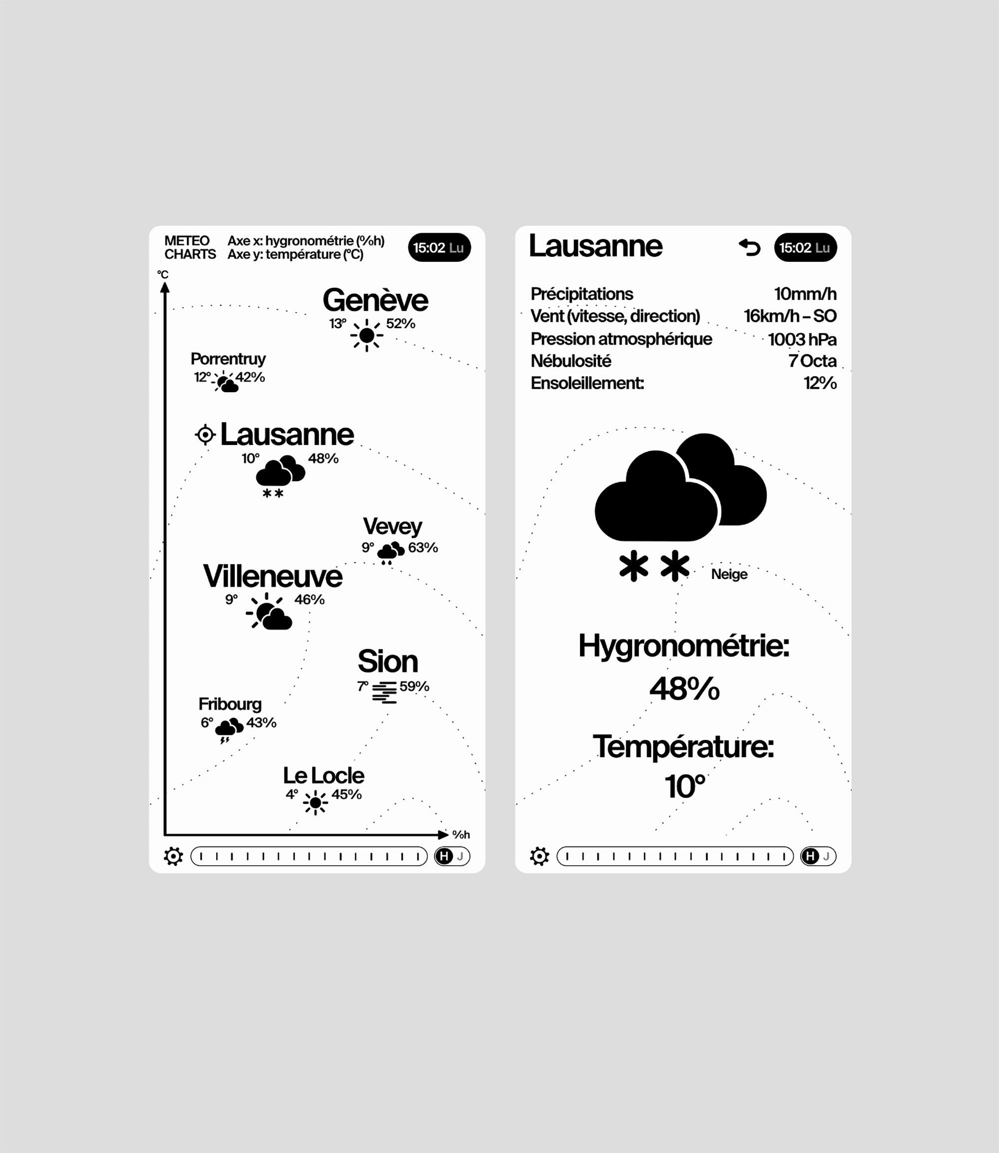
A great amount of research in the field of data visualization was carried out, and a choice of
representation was kept: an orthonormal, customizable axis system.
The concept is simple: the user defines the meteorological data associated with each of the two
axes, such as humidity versus temperature, and can therefore display the selected locations
according to this axis. A time-based representation of this data is also available, making is
possible to see the cities' data moving over time, and along the axis.